Overview

This project was completed in 2016. At the start of my journey into UX.
As a final project for completing the Bitmaker UX bootcamp program, each student was required complete a case study that identified and solved a challenge of their choosing. This page will walk you through my thought process in tackling my case study, Cnnct.
challenge.
70-80% of jobs are secured through networking and it's estimated that 40-50% of the population is introverted. For an introvert, attempting to network in-person within group settings is daunting.
The goal of this project is to provide a platform that evens the playing field for introverts. In turn, it would provide employers and other people of interest a chance to connect with them.
solution.
Cnnct - a networking app that allows a user to connect with people they've crossed paths with at their convenience.
The design revolves around the idea of users having business cards populated based on their LinkedIn account profiles. When two Cnnct users come within proximity of each other, these business cards would automatically be shared between them. Similar to dating apps, two users can chat with each other when they both express mutual interest in connecting.
Design process

It started with a book . . .
Quiet had a profound impact on me personally and helped me gain a deep understanding of what makes an introvert tick. Tapping into this book, I kept the following considerations in mind through out the design of Cnnct:
Introverts seek in-depth 1:1 conversations
Introverts have an aversion towards uninvited disruptions / intrusions to their thought process.
Introverts value being prepared in advance of a discussion and struggle with on-the-spot small talk.
Going off these three considerations, I knew I needed to design an app that was content-driven, uncluttered and straight-to-the-point.
user research.
To expand upon my understanding of introverts from Quiet, I set out to to conduct my own research. I collected five in-person interviews which included a mix of two introverts, two extroverts and an ambivert. The results of these interviews helped me form three personas and their respective job stories.
The three personas can be viewed here (click each image to view):


Establishing three diverse personas provided me with a scope of what was needed to appeal to extrovert and ambivert individuals in addition to introverts. Looping back to the original challenge, in order to improve the networking prospects for introverts, I knew the pool of Cnnct users must expand to include non-introverted persons.
The resulting job stories from all three personas are summarized to the right.

design research.
Professional, modern and clear; the design I set out to build needed to convey all three. To achieve this, I went with the following decisions in relation to establishing a style tile:
Colour
A colour palette consisting of shades of purple, grey and white. While most networking applications today use blue as their primary colour to convey communication and safety, my choice to go with purple takes the calmness of blue and combines it with the passion of red to convey ambition. In addition to purple, the inclusion of grey brings with it a notion of formality.
Typography
To achieve the modern look, I opted to focus on the use of two sans serif fonts. Bangla MN as the bolder font and Heiti SC as the lighter font to provide contrast.
Affordances
Taking a note on the importance of affordances from The Design of Everyday Things, I wanted to tie in affordances based on networking norms into the design. I landed on two key affordances:
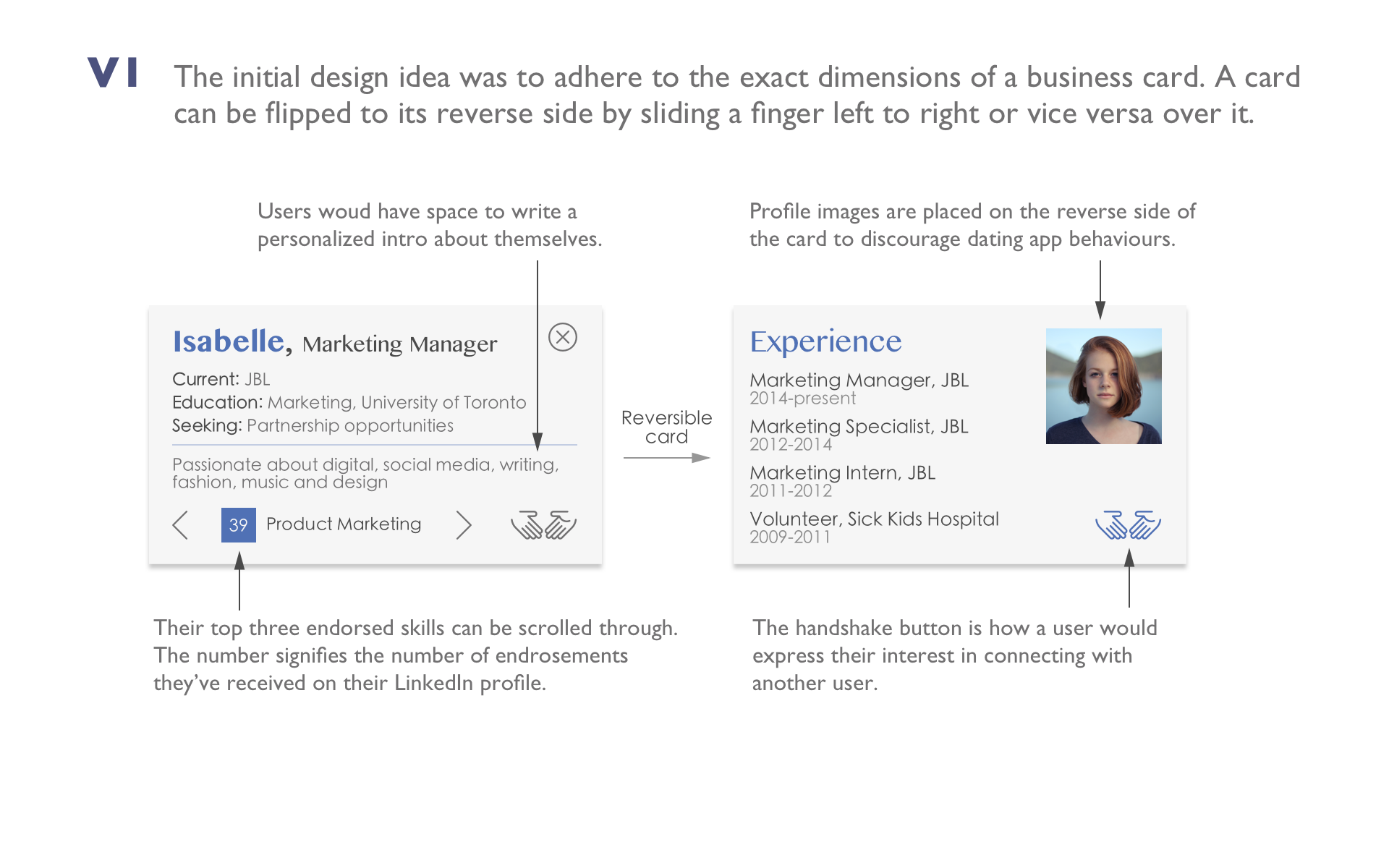
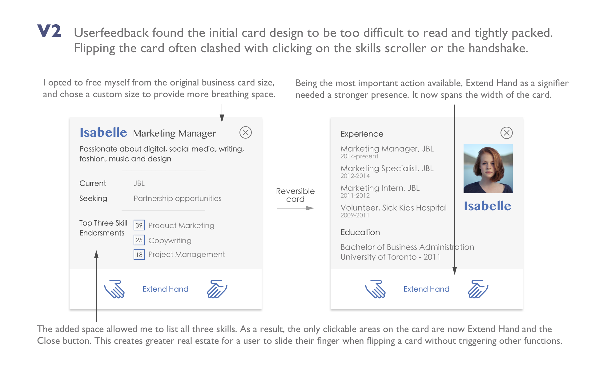
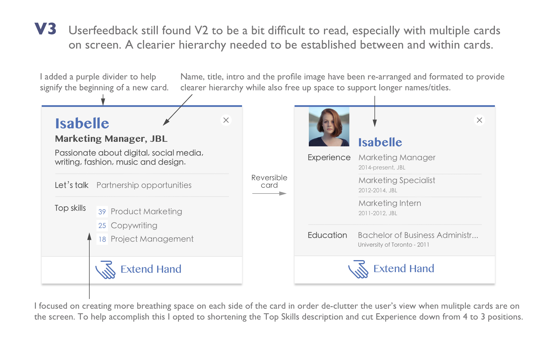
The use of business cards as the canvas for each user's profile. These cards would be flippable, providing more background information on each user. Designing a network app brings with it the risk of it transforming from a professional platform into another dating medium. With the flippable design, I intentionally placed a user's profile image on the reverse side of the card. The two-step process to viewing a user's image is intended to create a deterrence to the behaviour of browsing for profile images.
Using handshakes as means of expressing interest between users that want to connect.
Resulting Style Tile
userflow.
Having established a style tile, the process of laying out the user's flow was done in Balsamiq and laid down the blueprint for 4 weeks of sprints to wireframe, user test, mock up and hi-fi design the app.
iteration and user testing.
During the sprints, the assets that saw the most iteration were the cards. The cards needed to convey the following information:
Only the first name of a user and profile image as an option - to maintain their privacy
What reason they're seeking to connect with others. This provides introverts with the material needed to establish a topic of discussion.
A snapshot of their personality, experience, education and skills
The cards evolved based on feedback received through instructors and user testing. This included attending UserTestingTO and having attendees test out an Invision mock up. The evolution of the cards can be summarized into the following three major versions, with V3 being the final state.
closing remarks.
I hope this glimpse into my design process has piqued your interest in viewing the demo. If you haven't already. You can access the demo by clicking on the following button: